


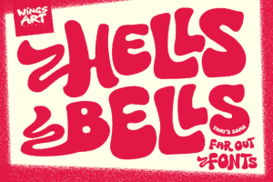


Hells Bells Font
$1,00
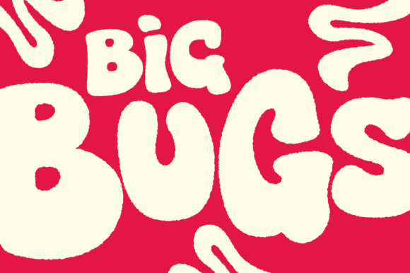
A Decorative Bell Bottom Style Font Inspired by 1970s Poster Design
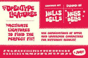
The graphic design trends of the 1970s borrowed from the classical styles of Art Nouveau and Art Deco, adding a contemporary spin with its own psychedelic curves and strobing colors that spoke to an era of prog-rock, funk, and bell-bottom flares. With Hells Bells I’ve attempted to design a font that fits with this aesthetic, taking advantage of advanced Opentype features to create a lettering system of automatic interlocking type and decorative alternatives that would suit the most far out of festival posters.
Be the first to review “Hells Bells Font”
Related products
Display Fonts
$1,00

$1,00


Fonts
$1,00


$1,00
Colorful Fonts
$1,00
Display Fonts
$1,00

Fonts
$1,00


Fonts
$1,00
Reviews
There are no reviews yet.